

Bay Area Technology School
Brookfield Elementary School
Skyline, outside security gate
Skyline, inside class 105
Skyline, inside classroom 20
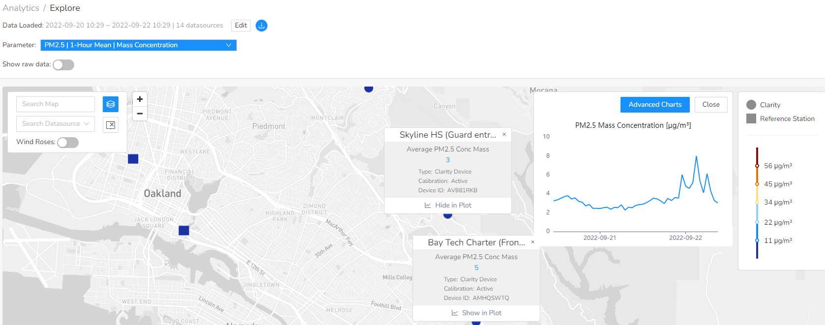
Download the monitor data here into a CSV file.
Download the monitor data here into a CSV file.
Keep this unselected. The raw data is uncalibrated and inaccurate
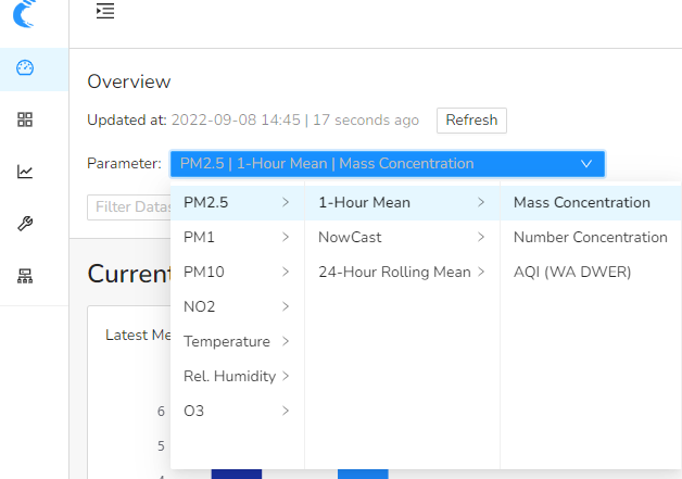
The mass concentration uses the unit micro grams per meter cubed.
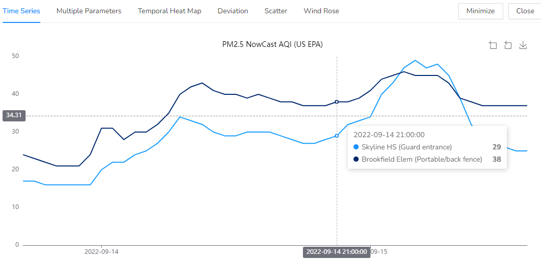
Time Series
X-axis is time and the Y-axis is AQI. We see two lines here because there are two monitors' measurements being compared.
Research question: Pick a significant date or time of day and assess the air quality across two or more monitors. How are they alike and how are they different?
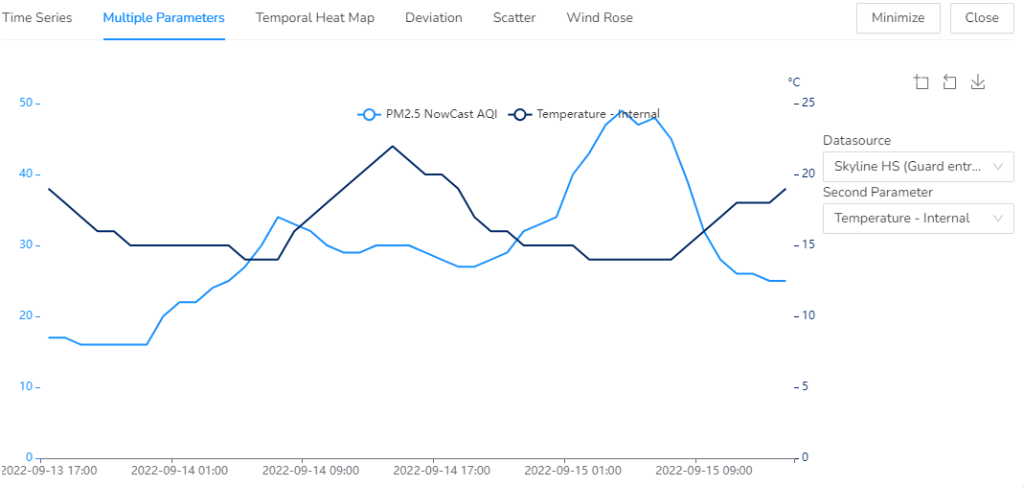
Multiple Parameters
X-axis is time (data and hour), and the Y-axis has two different measurements, comparing temperature in celcius on the right, to AQI on the left.
Research question: How does heat collect in different areas of the East Bay, in relation to the air quality? Are there other factors that may affect how the heat and poor air quality relate to one another within a specific location?
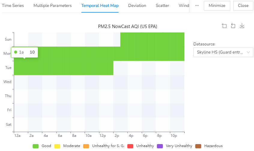
Temporal Heat Map
X-axis is time (hour), and the Y-axis is day of the week.
The color blocks indicate how the air quality shifts across the different categories of air quality from good to hazardous, symbolized with colors.
Research question: During a wildfire event, what are the major differences we see in air quality over the course of a week, comparing two different neighborhoods and the factors that may affect those differences?
You may need to reference other data if there has not been a recent local wildfire event.

Scatter
For this graph, be sure to choose two different monitor locations to plot. Select on for the x axis, and one of the y axis). This will compare how much the two locations differ in air quality from one another over
Research question: What two monitors are most similar to each other and what two are most different? What might explain these similarities and differences?
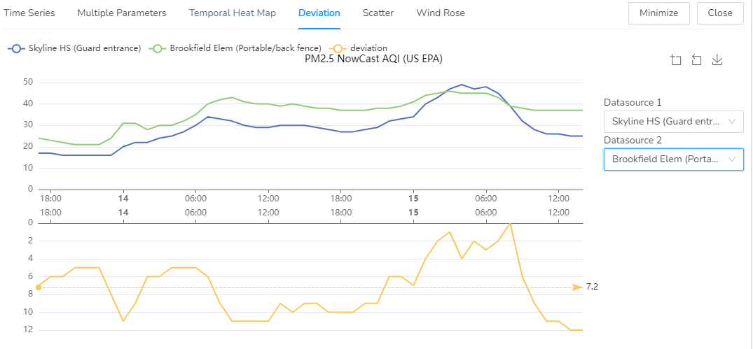
Deviation
This graph is best used with data from more than one monitor. On the x axis is time in hours, and on the y axis is AQI, but below is a range from 0-1 which will indicate on the graph, to what extent (by %) is the air quality shifting over the course of a day.